A tradition unlike any other… no, not The Masters on CBS — the Mavericks newest city edition jerseys being leaked well before they were intended to be officially revealed. 2020 was no different as tweets surfaced a few months back of this year’s new jersey simply dangling from a hanger in a sports gear/equipment store. This has seemingly happened the last two or three years and each time the Mavs fan base is left underwhelmed by the unprofessionally shot photo of the uniform. Some years more than others, but seemingly every time the initial feedback isn’t great.
I’m not HUGE on jerseys or anything. Not a single person on the planet would have me on their go-to list when it came to looking for fashion advice and I often say “It’s fine” whenever asked by my wife how anything looks on her or if someone asks me what I think about team X’s new uniforms. With the Mavericks being my favorite team in sports, however, I certainly have a little stronger opinion about what they choose to wear on the court than I do about what I put on to go to work for a random Tuesday in August. So, here I go trying to rank the Mavs’ last four city edition jerseys from worst to first.
4. 2018-2019 edition

The least interesting and inspired option of the bunch. There’s just something so plain and boring about the gray. The team’s previous attempt with silver went historically wrong back in 2003, so perhaps that’s why the team went with the more flat and unspectacular gray. There is nothing unique or remarkable about this. It’s just a slight play on the team’s normal royal blue color and adding the most plain color on the planet as the main option for the entire jersey.
I attended a game this season where they put a t-shirt version of the jersey on the back of every seat at the American Airlines Center and it, like all free t-shirts, has made its way into the “sleep shirt” rotation. You know how the free giveaway versions of a jersey are always a little more cheap looking and have some random sponsor on it where the actual jersey doesn’t? This giveaway shirt didn’t even look any different from the jersey because the real version was just that plain and boring.
3. 2017-2018 edition

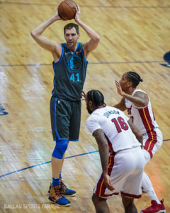
This photo is just a textbook edition of why these Mavs city edition jerseys are so disappointing. Other teams like Miami get the most badass, sexy and smartly infusing pop-culture and lore associated into the city with their jerseys. The Mavericks get a black uniform with big blocky letters outlined in colors that only DFW residents would know have anything to do with the downtown skyline of Dallas.
Don’t get me wrong, I love the colorful Dallas skyline and the way it has improved over the years with the additions of the Margaret Hunt Hill Bridge and other slick skyscrapers that have risen up in the last decade, but I think we might be overestimating the significance it has in the overall lore of major city skylines like in New York City, Chicago or Los Angeles.
These jerseys could essentially be tied with number four for their lack of flair, but I can roll with black more than I can roll with gray.
2. 2019-2020 edition

Hey, at least they swung for the fences here. This is probably the most polarizing uniform in recent DFW sports history. There is a large portion people (mainly those under the age of 15) who think these are awesome. I saw tons of them worn by fans at games last season and the court that went along with it was pretty cool. I really did not get the connection with Deep Ellum, graffiti and neon green collars and trim, but this was an actual attempt at creativity and I can applaud those in charge for that.
Would I buy one of these for myself? No, but I haven’t bought a Mavericks actual jersey in my life, so maybe I’m not the right guy to ask. I do, however, think that overall colors and idea here are worth putting this above the previous two very uninspiring efforts.
1. 2020-2021 edition
A departure from our traditional blue and a signal that a bright future is on the horizon ✨ @chime | #MFFL pic.twitter.com/Y3dfRK8Vvw
— Dallas Mavericks (@dallasmavs) November 24, 2020
When I first saw the photo of the jersey with a price tag on it, I was very underwhelmed by the font of the front and confused by the color scheme. Admittedly, I’m still not a fan of the font and still confused by the color scheme. I thought it looked like a tribute to the Disney or Dwayne Johnson Hercules movies or maybe that Brad Pitt movie Troy. Then the team posted this video earlier today:
Legacy is everything. @chime | #MFFL pic.twitter.com/NiJECFwb30
— Dallas Mavericks (@dallasmavs) November 24, 2020
The details all over this uniform are great. The wings on the side of the shorts and the jersey are a great nod to the iconic Pegasus that has been a staple of Dallas lore for decades. Of course this season is also the team’s 40th anniversary and having a big number 40 on the waistband is like a more slick version of a Texas-sized belt buckle.
Again, I wouldn’t buy this jersey to wear myself. I think I’m kind of just past that point in my life. As a dad, I don’t think I should be rocking a sleeveless shirt of any kind. I can, however, get with this overall look and definitely think it will look pretty great under the bright lights of an NBA arena. I’m excited to see the team wear them throughout this season.
Perhaps recency bias has a bit to do with these rankings — the oldest two ranking at the bottom and the two more recent ones at the top — but they just simply have become more inventive with these looks for the Mavericks over the last two years. Are they 100% home runs? Not at all, but they definitely do continue to improve each year.


You must be logged in to post a comment Login
You must log in to post a comment.